
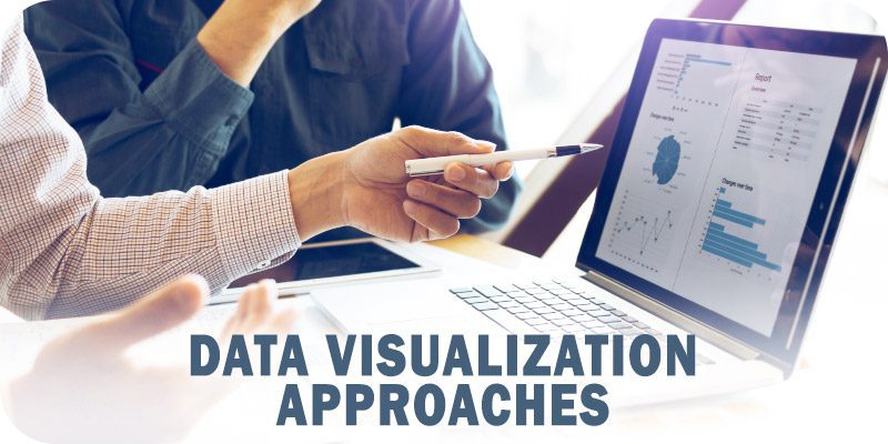
This is part of Solutions Review’s Premium Content Series, a collection of contributed columns written by industry experts in maturing software categories. In this submission, Swim co-founder and CTO Chris Sachs offers a look at the essential data visualization approaches to know.
 Watch and learn. That’s how most people like to do it. Whether it’s learning how to change a car tire, prepare a meal or analyze data, most people prefer to get their instructions and make decisions based on visual elements instead of text.
According to the Visual Teaching Alliance, approximately 65 percent of the population are visual learners. Over 80 percent of people tend to retain information delivered visually vs. 20 percent of what they read and 10 percent of what they hear. Visual learners prefer to use images, graphics, colors, and maps to communicate ideas and thoughts. Such visualized information is often more comprehensible than text- or audio-based explanations alone.
In a fast-paced digital culture of short attention spans and continuous data streams, massive volumes of data are being produced that make mission-critical decisions possible in milliseconds.
The human brain can process images and videos 60,000 times faster than text. But a basic video isn’t enough. We demand high-quality, vibrant, engaging content to capture and hold our attention.
Unfortunately, most enterprise big data environments still produce content equal to the era of silent black-and-white movies. Rather than streaming real-time data, they’re working with snapshots of information delivered sporadically in uninteresting formats. This approach is equivalent to driving a car with your eyes closed and opening them every couple of minutes to see what’s ahead of you.
In addition, those clunky data streams are gushing through a firehose, making it nearly impossible to analyze. Part of this challenge is the result of streaming data vs. streaming applications.
Streaming data, the approach more commonly applied to data analytics, produces large chunks of information that may or may not have anything to do with how you do business. Data is streamed straight into databases, where traditional business applications pick up the baton in a decidedly non-streaming fashion.
On the other hand, streaming applications are designed to support your business and run directly on top of streaming data. These applications consist of stateful web services, streaming APIs, and real-time user interfaces designed to run with motion and colors. Streaming applications revolve around real-time business models that are continuously updated by incoming streaming data.
For example, with continuous intelligence through streaming applications, a telecommunication provider can have constant visibility of its network structure to know immediately when changes are needed to keep services running. With ongoing insights about changes in power grids or user demands, they have the situational awareness to address network performance in real-time.
For online commerce, a national retailer with a complex network of suppliers and high volumes of inventory can tell customers exactly where their products are and when they can pick them up.
As connected self-driving cars become more prevalent, they will encounter waves upon waves of raw data to analyze as they move down the road. The average U.S. town will generate more daily data from traffic intersections than Twitter generates globally.
A connected vehicle doesn’t need all the data from every single intersection in a city – it only needs data pertinent to its intended route. The information is only relevant and valuable to the connected vehicle if delivered in the sub-second timeframe required for decision-making.
This connection between data and decision-making can only happen if operators have a clear and engaging picture of what they’re looking at. The right data visualization approaches can help organizations contend with the inundation of information – processing, analyzing, and visualizing all data in concert.
Five Data Visualization Approaches to Make Your Data Pop

Eliminate Dashboard Fatigue with a Splash of Color
Ask nearly any data analyst, and they’ll tell you they hate looking at raw data on boring dashboards. When displaying data, try to incorporate images as much as possible and highlight them with colors representing the status of whatever they’re monitoring. We like to tap into emotional colors like red or green that convey moods so they can tell at a glance if something is good or bad.
We also like to use dark backgrounds to contrast with colors, making the screens easier to read and catching the user’s attention through their peripheral vision.
Use Motion to Establish Trust
Users need to trust that their information is accurate. Traditional big data normally arrives as static numbers that can be analyzed until the next updated data arrives. Again think of the snapshot and of someone driving while opening their eyes every five minutes to see what’s in front of them. Streaming applications provide real-time data that can be displayed in motion. As long as the user can see these data points ripple with time, they can have confidence that they’re current and reflect their operations’ real-time status.
Color-Accentuated Focus Areas
Because of the massive amounts of data users are dealing with, it’s important to focus their attention where it’s needed the most. This is where you can use specific colors to highlight critical areas of concern. Motion again is used in this case to show where those areas of concern can fluctuate in real-time.
Use Animation to Communicate Updates
Just as color can help display information as it updates, animation can provide a means of grabbing the user’s attention. Too many times, users are forced to retrieve information. That period between retrievals might miss critical updates and alerts. Animation can be used to make the difference between retrieving information and overseeing it as it refreshes in front of your eyes.
Let Your Data Speak for Itself
Knowing that most humans are visual learners, it’s critical to visualize data in a way that makes it easy to understand how it moves over time. The best way to do this is to humanize your visuals by giving them visual life. You’re actually giving the visual of that data an element of life and a voice. So not only does it help to visualize the data, but it lets the data speak.
I like to think data is called a science because it gives us ideas. But there’s also the issue of creativity. Yes, data is all about math and formulas. But it’s also a creative process that helps us think about things differently. Data visualization tools provide us with both. We have the information that tells us what analytics to write and the ability to apply some level of intuition to the problem at hand.

Chris Sachs
Chris is the creator and lead developer of Swim, the first open source, full stack streaming application platform. He excels at building vertically integrated software stacks from first principles. Leveraging the power of design thinking, Chris strives to solve deep technical problems for the benefit of humans.