

The Ultimate List of 21 Free and Open Source Data Visualization Tools
-
 By
Tim King
, Executive Editor at Solutions Review
By
Tim King
, Executive Editor at Solutions Review - Best Practices,
Solutions Review has compiled this up-to-date list of free and open-source data visualization tools you should consider using.
Searching for data visualization software can be a painstaking (and even expensive) process, one that requires lots of research and in some cases, a lofty budget. Thankfully, there are a number of free and open source data visualization tools out there. While the most popular enterprise data visualization tools often provide more than what’s necessary for non-enterprise organizations, with advanced features relevant to only the most technically savvy users. While a number of these solutions are offered by providers hoping to eventually sell you on their commercial products, others are maintained and operated by a community of developers looking to democratize the process of insight generation.
In this article we will examine free and open source data visualization tools, first by providing a brief overview of each and what to expect as you begin your search. We’ve profiled each tool and labeled them using an ![]() or
or ![]() icon for open source or commercially free. This is the most complete and up-to-date directory of free and open source data visualization tools on the web.
icon for open source or commercially free. This is the most complete and up-to-date directory of free and open source data visualization tools on the web.

The Best Free and Open Source Data Visualization Tools
Candela 
 Candela is an open source suite of web visualization components for Kitware‘s Resonant platform. The tool enables users to make scalable, rich visualizations available with a normalized API for use in real-world data science applications. Integrated components include LineUp dynamic ranking by Harvard University, OnSet visualization by George Institute of Technology, Vega visualizations by University of Washington, and GeoJS by Kitware’s Resonant platform.
Chart Studio
 Chart Studio is an editor for creating D3.js and WebGL charts. It doesn’t require coding and uses a drag-and-drop interface for connecting to SQL. Users can then share securely online in a similar fashion to Google Docs. Charts can also be embedded in company wikis, reports or dashboards. Chart Studio is built on top of Plotly React and other open source projects. The free Community Edition allows for public charts and dashboards, live updates and a package of 25 charts. There are Student, Personal, and Professional Editions available as well.
Charted 
 Charted is a free tool for automatically visualizing data, and was created by the Product Science team at blogging platform Medium. The tool re-fetches data every 30 minutes to ensure that the visualized chart is always up-to-date. Charted currently supports CSV and TSV files, as well as Google Spreadsheets with shareable links and Dropbox share links to supported files. Medium says the best use for Charted are checking ad-hoc data query results, building dashboards, displaying basic metrics, and presenting data visually.
Chartist
 Chartist is an open source charting library that enables you to create highly customizable and responsive charts. The tool provides simple handling while using convention over configuration, as well as flexibility while using clear separation of concerns. Chartist is DPI independent, offers responsive configuration with media queries, and customizable with Sass. The service also allows for limitless animation possibilities with an animation API, and users can configure different chart behaviors for different media types.
ColorBrewer
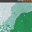 ColorBrewer is a free online tool designed to help you select color schemes for maps and other data vsualizations. While this is not a diagnostic service, it can be used to test drive a given color scheme to see if fits a given visual. Users can choose from a number of data classes, the nature of the data being visualized, and a variety of color scheme options, including context, background, and specific hues. ColorBrewer requires only a Flash plug-in to use and is a product of Penn State University.
D3.js
 D3.js is an open source JavaScript library for creating interactive data visualizations in web browsers. The tool uses HTML, SVG and CSS, and with an emphasis on web standards provides you all the capabilities of modern browsers without tying you to a proprietary framework. D3 combines powerful data visualization components and a data-driven approach to DOM manipulation. It employs a declarative approach and operates on arbitrary sets of nodes called selections.
Datawrapper
 Datawrapper provides a web tool for creating a variety of interactive charts and maps. No code or design skills are required, and charts can be embedded in your website. Users can simply copy data from Excel or Google Sheets or upload CSV files or link to a URL for live-updating. The basic (free) version allows for 1 user, 1 locator map, and 10,000 chart views per month. There are also several paid offerings that include access for additional users and more advanced capabilities.
dygraphs
 dygraphs is a flexible open source JavaScript library that allows users to explore and interpret dense data sets. Charts are interactive, allowing users to mouse over to highlight individual values. dygraphs can handle very large data sets and features strong support for error bars and confidence intervals. It is highly customizable and uses options and custom callbacks as well. It works in all recent browsers, and you can even pinch to zoom on mobile. dygraphs supports an active user community too.
Flot
 Flot is an open source JavaScript plotting library for jQuery. The tool was designed to be simple to use with an attractive UI and interactive capabilities. It works with Internet Explore 6+, Chrome, Firefox 2+, Safara 3+, and Opera 9.5+. Basic use cases include different graph types, simple categories and textual data, as well as chart annotation and updating graphs with AJAX. Users can choose from a number of axes and additional functionality as well, including thresholding data, stacked charts, and a plot legend.
Google Charts
 Google Charts is a simple and free web service that allows for the creation of charts from user-supplied information. You can choose from a variety of charts including scatter plots to hierarchical tree maps. Users can then configure them via an extensive set of options, as well as connect charts and controls into an interactive dashboard. The tool offers cross-browser compatibility and cross-platform portability to iOS and Android as well, and connecting to data in real-time using a number of data connection tools and protocols is easy to do.
Google Data Studio
 Google Data Studio is a dashboard and reporting tool that is free to Google account users and Google Cloud Platform customers. Users can choose from a broad array of charts, graphs, pivot tales and visualizations, including time series, bar charts, pie charts, tables, heat maps, geo maps and more. Each visualization has built-in comparison functions, making it easy to see changes in the data period over period. Data Studio was designed for non-technical users, and sharing and collaboration are major parts of the platform.
Highcharts
 Highcharts is an SVG-based, multi-platform charting library that has been actively developed since 2009. It allows users to create interactive and mobile-optimized charts to your web and mobile projects. It offers documentation, advanced responsiveness, and accessibility support. Highcharts is free and open source for non-commercial users, and the tool works with any back-end database or server stack. Data can be given in any form, including CSV, JSON or loaded and updated live.
Leaflet
 Leaflet is a JavaScript library for creating interactive mobile maps. It was designed to be simple, usable and provide high performance, and weighs only 38 KB of JS. According to the official page, it has all the mapping features most developers ever need. Leaflet works across all major desktop and mobile platforms and can be extended with a variety of plugins. The API is well documented and easy-to-use as well. Key performance features include hardware acceleration on mobile, smart polyline and polygon rendering, and a modular build system.
myHeatmap
 myHeatmap offers a free service that allows you to create color-coded heat maps. The key here is simplicity, and maps created using the tool aren’t cluttered with markers or flags, making data simple to distinguish as hot and cold. Maps created with the service are interactive, and viewers will be able to pan and display your data at any zoom level. Readers can also switch between different data sets within the same map. The free version features unlimited public maps (but no private maps) and 20 data points.
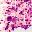
OpenHeatMap
 OpenHeatMap is a basic, free tool that allows you to turn spreadsheets into a map. Users can simply upload an Excel, CSV file or Google Doc and the service spits out a visual. The tool also allows users to share their map with others with a title, hyperlink and other basic inputs. OpenHeatMap also enables users to publish their maps to the web. This is by far the most simplistic tool we’ve profiled in this directory, but it may be just what you need to turn your raw data into a proper visual.
Palladio
 Palladio is a web-based platform for visualizing complex and multi-dimensional data. It is a product of the Networks in History from Stanford University. Once you create a new project, your data can be viewed in a number of different views. The map view allows you to see any coordinates data as points on a map, while graph view enables you to visualize the relationship between any two dimensions. The list view allows dimensions of data to be arranged to make customized lists.
Polymaps
 Polymaps is an open source JavaScript library for making interactive maps in modern web browsers. It provides speedy display of multi-zoom datasets over maps, and supports an array of visual presentations for tiled vector data. It is ideal for showing information from country level on down to states, cities, neighborhoods, and individual streets. Because Polymaps uses SVG (Scalable Vector Graphics) to display information, you can use familiar, comfortable CSS rules to define the design of your data.
RAW Graphs
 RAW Graphs is an open source data visualization framework originally designed to provide the missing link between spreadsheet applications and vector graphics editors. Users can choose from a wide range of available charts that are not easily produced by other tools. RAW Graphs also allows users to export visualizations as vector or raster images and embed them into a web page. Visualizations can also be opened in a vector graphics editor so you can improve them.
Tableau Public
 Tableau Public is a commercially free service that allows anyone to publish interactive data visualizations to the web. Published “vizzes” can be embedded into web pages and blogs, and they can be shared via social media or email, and they can be made available for download to other users. As soon as a workbook is published to Tableau Public, the viz is accessible by anyone in the world.Visualizations are created in the accompanying app Tableau Desktop Public Edition and require no programming skills.
TimelineJS
 TimelineJS is an open source tool that enables you to build interactive visual timelines. It works on any site or blog, and beginners can get started using nothing more than a Google spreadsheet. More advanced users can use JSON skills to create custom installations while keeping TimelineJS’s core capabilities intact. The tool can pull in media from a wide variety of sources including Twitter, Flickr, YouTube, Vimeo, Google Maps, Wikipedia, SoundCloud, Document Cloud, and more. TimelineJS is a product of Northwestern University’s Knight Lab.
WebDataRocks
 WebDataRocks is a free reporting tool for data analysis and visualization with simple integration and analysis of complex data. It is written in JavaScript and displays your CSV or JSON data in an interactive pivot table. WebDataRocks works on any device and can be embedded into a web page as well. Key features include filtering, sorting, grouping, conditional and number formatting, and calculated values. Users can print or export a web report to PDF, Excel or HTML easily.
If you’re looking for an enterprise data analytics solution, consult our freshly updated Business Intelligence Buyer’s Guide.

Tim King
Executive Editor
Tim is Solutions Review's Executive Editor and leads coverage on data management and analytics. A 2017 and 2018 Most Influential Business Journalist and 2021 "Who's Who" in Data Management, Tim is a recognized industry thought leader and changemaker. Story? Reach him via email at tking@solutionsreview dot com.
- Analytics and Data Science News for the Week of April 12; Updates from Alteryx, MicroStrategy, Starburst & More - April 12, 2024
- Analytics and Data Science News for the Week of April 5; Updates from Databricks, Qlik, Salesforce & More - April 4, 2024
- Analytics and Data Science News for the Week of March 28; Updates from Databricks, MicroStrategy, Qlik & More - March 29, 2024