Coronavirus Update: These COVID 19 Map Dashboards Track the Spread
-
 By
Tim King
, Executive Editor at Solutions Review
By
Tim King
, Executive Editor at Solutions Review - Best Practices,

Looking for a Coronavirus update? Track the COVID 19 pandemic with the help of these data and analytics vendor-created dashboards and resources.
Business software companies are pitching in on a massive scale to do their part during the COVID-19 Coronavirus pandemic. Data and analytics providers are doing much of the heavy lifting, offering up free access to data, tools, and even consulting services that can be used by researchers and front-line workers alike. Other data tools vendors are providing a Coronavirus update through the development of freely viewable COVID 19 map dashboards, similar to the original and often-cited resource created by Johns Hopkins University.
The editors at Solutions Review are hoping to do their small part by compiling this list of data and analytics vendor-created dashboards. We will update this post with additional resources as they become available.
Note: Click on the dashboard image or View Dashboard to see each.

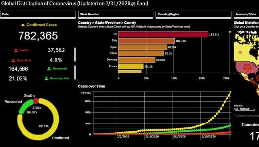
MicroStrategy COVID 19 Dossier
MicroStrategy has accessed Coronavirus outbreak data provided by the Center for Systems Science and Engineering at Johns Hopkins University, this is an interactive dossier that will be updated daily. The dossier shows how many people have been infected, how many have recovered, and how many deaths have been caused by the virus by both geography and time. You can drill down to a specific country and see associated trends, or click on a day to take a look at outbreak statistics.
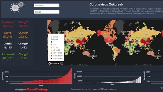
View Dashboard
Tableau Coronavirus Data Resource Hub
Tableau’s COVID-19 Coronavirus Data Hub is made up of a global dashboard, access to the data sources (W.H.O, Johns Hopkins, Nextstrain), and ideas about how to get involved. The Data Hub also includes a collection of Coronavirus update maps, trackers and curated data visualizations by users/customers, including CNBC Digital and the Kaiser Family Foundation. Update: Tableau just released the Coronavirus Daily Global Tracker dashboard that visualizes important global indicators and metrics.
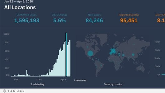
View Dashboard
Domo Coronavirus (COVID-19) Tracker
The Domo Coronavirus (COVID-19) Tracker gathers the latest statistics on the outbreak from W.H.O., CDC, and Johns Hopkins University. Data is curated by Enigma. This tracker includes a latest summary and news section where recent updates are shared. The Domo tracker can also be embeded on other sites. Use this dashboard to see how rapidly the pandemic is spreading and a snapshot of cases over a period of time. Update: Domo has added county-level infection statistics, stay-at-home orders and testing-by-state data to this resource.
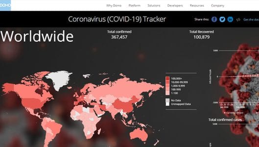
View Dashboard
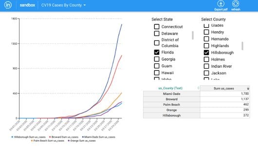
Knowi Coronavirus Dashboard Data Hub
Knowi’s public Coronavirus Data Hub is based on data sources like Johns Hopkins University, CDC, and W.H.O. that the company will be continually updating. There are multiple individual dashboards, created with the aim of providing critical statistics and visualizations across the world and by country. The dashboards provide current numbers of cases (confirmed, recovered, active, and deaths), comprehensive information by county/province, and allow the user to further segment and/or ask questions about the data.
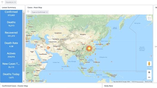
View Dashboard
DataRobot Predicting COVID-19 on the U.S. County Level
DataRobot’s Predicting COVID-19 on the U.S. County Level features a map that shows currently infected counties and 50 that are projected to be high risk. Results are based off of the DataRobot enterprise AI platform. Models predict which counties are ‘high risk’ based on which are projected to record their first COVID-19 cases in the next five days.
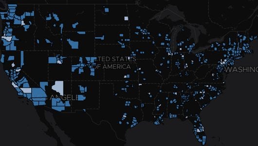
View Dashboard
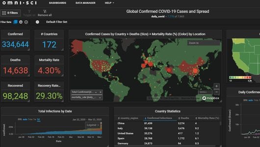
OmniSci COVID-19 Dashboard
The OmniSci COVID-19 Dashboard is based on the company’s Immerse product and updated daily with the latest Coronavirus data. There are a number of different filters that can be applied, as well as ways to see data from different regions through OmniSci’s data manager.
View Dashboard
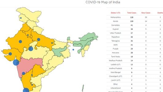
Smarten COVID-19 Map of India
Smarten is a data preparation and analytics solution provider based in India. In addition to a page featuring India Coronavirus trends and statistics, the COVID-19 Map of India provides a way to drill-down based on the territory. The tracker on the right side of the page records cases by state, total cases, new cases, deaths, cure rates, and whether an infected person is an Indian citizen or foreign national.
View Dashboard
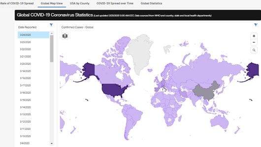
IBM/Weather Channel Global COVID-19 Coronavirus Statistics Dashboard
This interactive dashboard is driven by IBM Watson and built on IBM Cognos Analytics. Available global data includes confirmed cases, recoveries where available and more, and users can drill down to the country, region, state and county level as needed to get further insights. This aggregated data could potentially help others collect insights and show how cases are trending over time.
View Dashboard
Tracking COVID-19 with Qlik Sense (Copley Consulting Group)
Copley Consulting Group has unified disparate data from multiple sources and built an interactive Qlik Sense application to track daily, weekly and monthly critical data elements to provide a more holistic view of the COVID-19 impact. This data is being provided with the hopes that people will gain deeper and meaningful insight as to the challenges faced and provide some degree of reassurance as we move toward controlling this virus.
View Dashboard
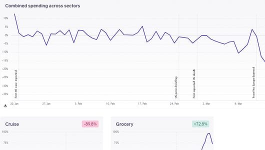
COVID-19 Consumer Insight Tracker (By Emarsys and GoodData)
This COVID-19 tracker by Emarsys and GoodData visualizes the daily economic impact of Coronavirus on ecommerce consumer spending across the globe and by sector. The dashboard draws from activity of more than 1 billion anonymous consumers and 400 million orders across 2,500 businesses in 120 countries. The platform also acts as a crowdsourcing community hub for business owners, economists, academics and policy makers.
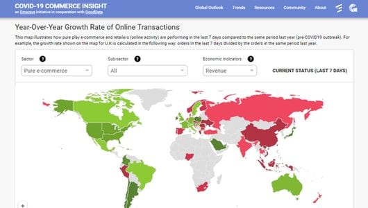
View Dashboard
COVID-19 Impact Dashboard (By 1010data and Exabel)
The COVID-19 Impact Dashboard by 1010data and Exabel provides a live view of consumer spending, based on credit and debit card usage across the United States. Live transaction data from credit and debit card usage is a way to get a very early indication of changes in consumer behaviour. Trends seen here will often be reflected in companies’ quarterly earnings reports, US census statistics and in GDP – but not until several weeks or months later.
View Dashboard
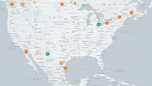
Current Border Crossing Transit Times/ Port Congestion Times for Container Vessels (FourKites)
Supply chain visibility platform company FourKites has developed an interactive dashboard that tracks current border crossing transit times and port congestion times for container vessels. The times on the maps are based on all the cross-border loads in the FourKites network, over the past 24 hours. Users can toggle between border crossings and port congestion for more than 230 ports worldwide.
View Dashboard
COVID-19 Data Analysis (Inzata)
Inzata has launched this special dashboard project to provide analytic information about the COVID-19 pandemic. Inzata collected and combined data from a variety of public health sources to provide this resource. Data is automatically updated daily as new information is published. A public username and password provides the user with US testing data, cases by county and hospital capacities by state.
View Dashboard
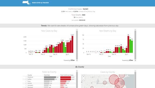
MASS COVID 10 Tracker by Hashpath Consulting (Powered by Looker)
Product management and business intelligence consulting firm Hashpath Consulting created this Massachusetts-centric COVID tracker using Looker and Google BigQuery. The dashboard includes new cases by day, deaths by day, totals by county, cases by county and a state comparison that shows how Massachusetts is doing compared to other states.
View Dashboard
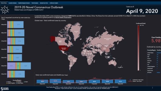
SAS Coronavirus Report (Powered by SAS Viya)
The SAS Coronavirus Report is powered by SAS Viya. The main dashboard highlights ‘global status’ as of the viewing day. Readers can toggle to location analysis, epidemiological analysis, trend analysis, spread over time, and collective insights. The visual also shows the top 5 impacted countries by new cases over the last 7 days.
View Dashboard
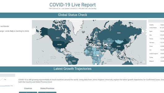
COVID-19 Live Report (TIBCO Spotfire)
TIBCO’s COVID-19 Live Report dashboard provides a global status check on confirmed cases around the globe. Powered by the Spotfire platform, the resource lets users dive deep with overviews of the globe, different regions, and US counties. The Live Report also features different ways to analyze outbreak hotspots, locate nearby healthcare resources, estimate the disease spread rate and more.
View Dashboard
Solutions Review is keeping an ongoing Twitter thread of data and analytics vendor activity related to the pandemic, including free access to research and tools, Coronavirus maps and dashboards, and consulting services for those in affected industries.

Tim King
Executive Editor
Tim is Solutions Review's Executive Editor covering the human impact of AI on the future of work and learning. He is also the Media Strategist behind Insight Jam (1M+ on YouTube) events and programming. A 2017 and 2018 Most Influential Business Journalist and 2021 "Who's Who" in multiple categories, Tim is a recognized thought leader in enterprise tech and AI.
- Analytics and Data Science News for the Week of June 26; Updates from Databricks, Dataiku, WisdomAI & More - June 26, 2026
- Analytics and Data Science News for the Week of June 19; Updates from Databricks, Gartner, Qrvey & More - June 19, 2026
- Analytics and Data Science News for the Week of June 12; Updates from Databricks, Dataiku, Golden Analytics & More - June 12, 2026