It’s no secret that design can have a profound impact on how users react to a solution. In the realm of Network Performance Monitoring, a solid easy to read GUI is essential to be able to understand what is going on with your network. Imagine a book with text too small to read, you might end up missing out on the story. Today we are going to go into some of the top GUIs (in no particular order) found in NPM.
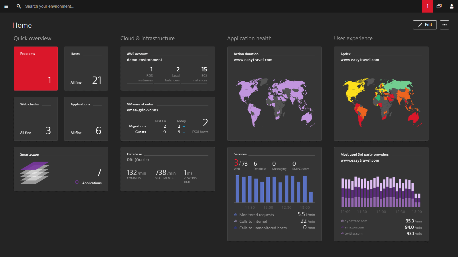
Dynatrace
When it comes to clean and easy to ingest GUI, Dynatrace nails it with a relaxing dark theme that puts the important things into focus while doing away with the clutter. With an intuitive dashboard and well-designed data visualization – finding your way around will be easy.
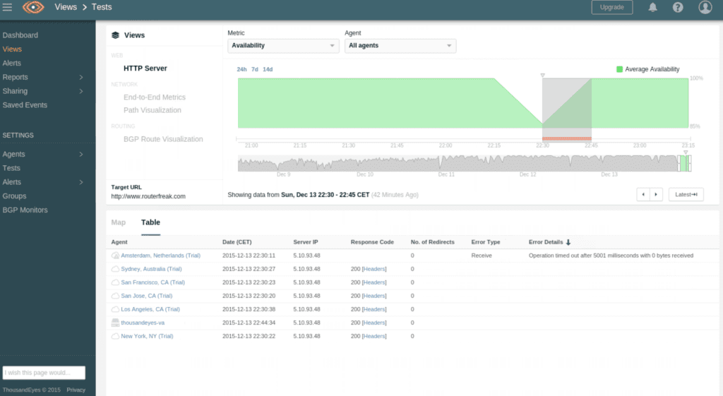
ThousandEyes
ThousandEyes has path visualization in the bag, but they also boast a clean and intuitive GUI that keeps everything tucked away until you need it. Keeping everything simple ensures that the user isn’t bogged down with small text.
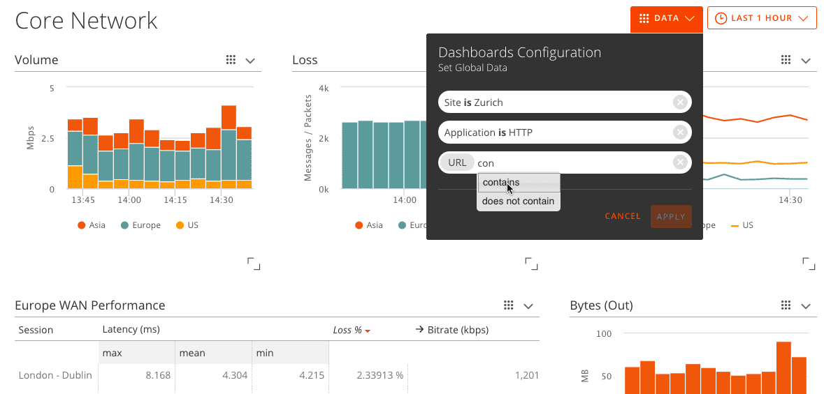
Corvil
FlatUI is great, but ultraLightUI has it’s place too. If you’re a fan of Apple style clean GUI then Corvil is the one. Following the classic approach of putting the data on the table, Corvil does it’s best to make it as easy-on-the-eyes as possible. Sometimes having all the information laid out in front of you isn’t bad after all.
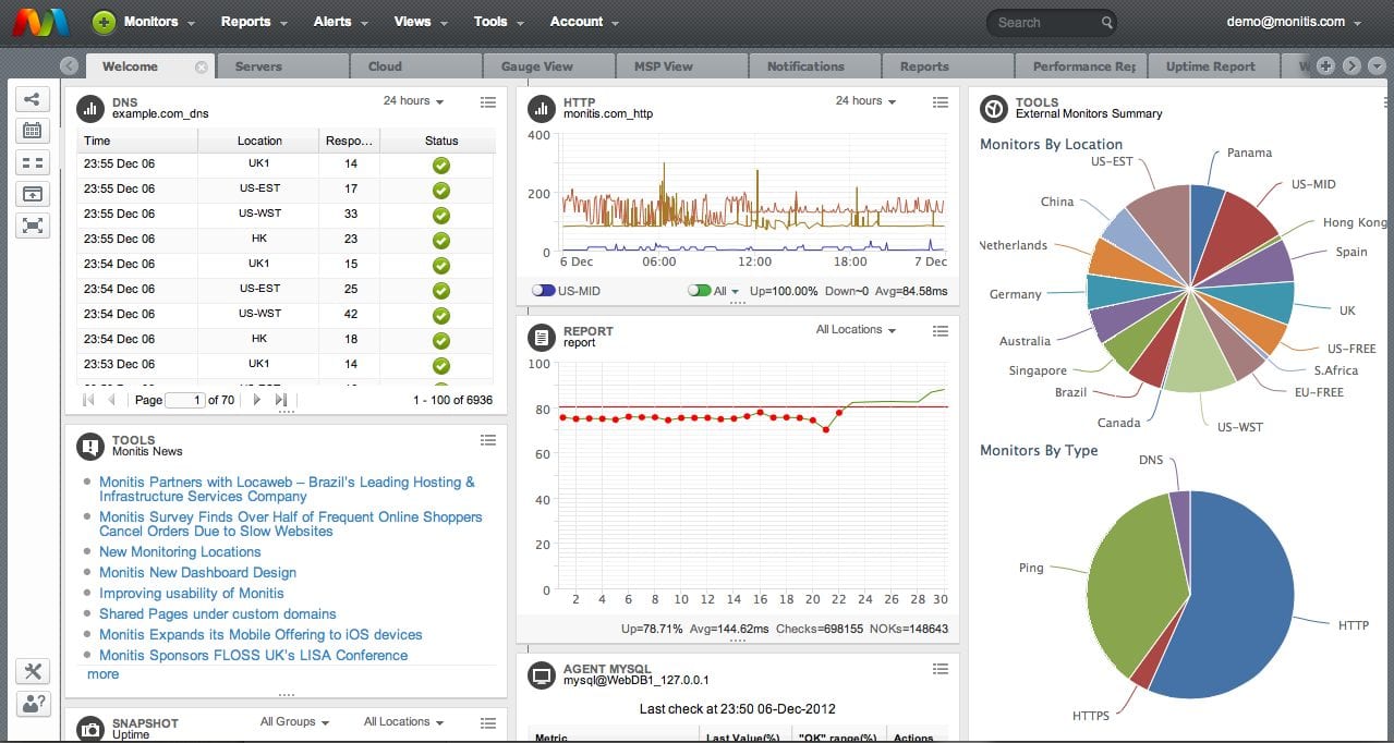
Monitis
Don’t be fooled by Monitis’s slightly dated look. Everything is right where you need it. With the power of tab interface, insights are just a click away.
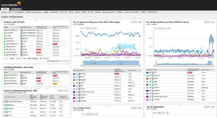
SolarWinds
SolarWinds, much like Monitis, believes in tabs and while their GUI might be a bit intimidating to look at. You will find upon closer look that it isn’t as bad as it seems. This is perhaps the most classic of the top 5 list, but truly nothing is wasted here. To the eyes of a professional IT, this is about as close to home as it gets.
Closing thoughts
GUIs are highly subjective and while they do have a huge impact on the way users perceive the quality of the product, it will never mask the actual quality. Some professionals might prefer the classic operator look that hearkens to the 90s, while others might embrace the new hot visualizations that are becoming evermore prevalent in modern UI. It’s important to consult with your teams IT professional to see what they prefer. At the end of the day, they will be the one digesting the information your NPM solution presents.
Doug Atkinson
An entrepreneur and executive with a passion for enterprise technology, Doug founded Solutions Review in 2012. He has previously served as a newspaper boy, a McDonald's grill cook, a bartender, a political consultant, a web developer, the VP of Sales for e-Dialog - a digital marketing agency - and as Special Assistant to Governor William Weld of Massachusetts.
- Where are 5G Networks for Enterprises? - December 21, 2018
- Solutions Review Best of 2018: Top Network Performance Monitoring Articles - December 20, 2018
- What is Network Management and Where Does Network Monitoring Fit? - December 19, 2018