The Top Five Key Data Visualization Techniques to Utilize Right Now
-
 By
Tim King
, Executive Editor at Solutions Review
By
Tim King
, Executive Editor at Solutions Review - Best Practices,
The editors at Solutions Review highlight five key data visualization techniques to utilize right now to enhance data storytelling.
Data visualization is a graphical or visual representation of a large amount of data in the form of charts, graphs, and maps which helps analyze the data by identifying the patterns and trends following the data. In this article, we will discuss data science visualization, the applications and benefits of data visualization, and the different types of analysis such as univariate, bivariate, and multivariate data visualization. We will also discuss the top data visualization techniques, which include line charts, histograms, pie charts, area plots, and scatter plots that can help you understand your data better.
So before going on to the techniques of data visualization, let us look at what is data science visualization and its benefits.

Data Visualization Techniques
What is Data Science Visualization?
Data science visualization refers to the graphical representation of data using various graphics such as charts, plots, maps, graphs, and infographics. Data visualization makes it easier for human beings to understand the data by analyzing patterns and trends, which helps in generating valuable business insights. Data visualization can even help identify critical relationships in various charts and plots that may prove fruitful for businesses.
Data scientists analyze, interpret and visualize various large datasets regularly with the help of multiple data visualization tools such as Tableau, Sisense, Microsoft Power BI, Microsoft Excel, Looker, and Zoho Analytics.
Today data visualization has its application in various fields such as healthcare, finance, marketing, data science, military, E-commerce, education, etc., as it helps in organizing the data in a way that is not possible through traditional techniques, and thus, it helps in the faster data processing. Check out to learn more about critical aspects of data science visualization.
Benefits of Data Visualization
Data visualization is a technique of graphical representation of data that helps us in faster data processing and making improved business decisions. Some of the benefits of data visualization are:
- Identifying Business Trends: Data visualization helps you analyze the trends prevailing in the market by visualizing the data of past years and understanding them. By preparing trend reports, you can figure out how business affects the market as well we can also gain an understanding of the competitors and customers.
- Simplification of Complex Data: Business data is often available in large chunks, and processing such data is always tricky. Data visualization simplifies the data and increases its usability by making it available in the form of graphics which can be processed by human brains faster.
- Faster Decision-Making: Visual presentation of data is always more accessible for human brains to process and interpret; thus, data visualization ultimately boosts the speed of the decision-making process for businesses.
- Helps in Identifying Data Relationships and Dependencies: Analyzing various visual charts and graphs simultaneously helps the business identify different relationships and unobvious dependencies between the data and find multiple links between related data.
- Identifying Errors and Risks: In many cases, visualized data helps the managers to gain a better understanding of the business as it removes the complexity of the data, and thus managers find it easier to identify any threat that can affect the business or the risks to which the business may be vulnerable and thus helps the business to prepare for such risks in advance.
Different Types of Analysis for Data Visualization
The three different types of analysis for data visualization are:
- Univariate Analysis: In the Univariate Analysis of Data Visualization, you use only a single feature to analyze all of its properties.
- Bivariate Analysis: In the Bivariate Analysis of Data Visualization, the data to be visualized is compared between exactly two (BI) features.
- Multivariate Analysis: The data is compared on more than two variables in the Multivariate Analysis of data visualization.
Top Five Data Visualization Techniques
Data visualization techniques involve generating the graphical or visual representation of the data to identify various patterns, trends, correlations, and dependencies to gain valuable insights. Let us have a look at the top five data visualization techniques that are used commonly:
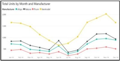
Line Chart: A line chart or line plot displays information as a series of data points connected by a straight line. A line chart displays any relationship between two variables on the respective X and Y-axis. It is most commonly used to compare several variables and analyze trends.
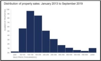
Histogram: A histogram is the graphical representation of a set of numerical data in the form of rectangle blocks connected. A histogram represents only the quantitative data, unlike the bar chart. It is used to figure out any unusual observation or gap present in the large dataset.
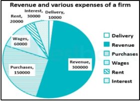
Pie Chart: A pie chart represents the data in a circular statistical graphic form. It records data in the form of numbers, percentages, or degrees. It is the most common form of graphical representation used in business presentations to depict various data related to orders, sales, revenue, profit, loss, etc. Pie chart are divided into sectors that represent the percentage of the whole.
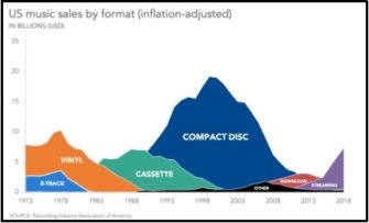
Area Plot: An area plot is almost similar to the line chart or can be defined as a special form of a line chart where to highlight the distance between different variables, the region below the line is filled with a color instead of just connecting the data with a continuous line. It helps to show the rise and fall of data, changes over time, categorical breakdowns, etc.
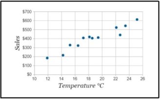
Scatter Plot: A scatter plot is a graphical representation used to observe and display the relationship between two variables. It uses dots to illustrate values for two different horizontal and vertical axis variables. Scatter plots are used to monitor the relationship between variables.
Conclusion
Data science visualization is an essential tool as it helps you analyze hidden patterns and relationships between variables through the graphical presentation of data. It is still an important tool and is a must-have skill for data scientists and data analysts to derive insights from complex business data. In this article, we discussed various data Visualization techniques like line charts, histograms, scatter plots, and others.

Tim King
Executive Editor
Tim is Solutions Review's Executive Editor and leads coverage on data management and analytics. A 2017 and 2018 Most Influential Business Journalist and 2021 "Who's Who" in Data Management, Tim is a recognized industry thought leader and changemaker. Story? Reach him via email at tking@solutionsreview dot com.
- Analytics and Data Science News for the Week of July 4; Updates from Domo, Manta AI, Power BI & More - July 3, 2025
- Analytics and Data Science News for the Week of June 20; Updates from Databricks, Domino Data Lab, Gartner & More - June 20, 2025
- Analytics and Data Science News for the Week of June 12; Updates from Anaconda, Databricks, DATA POEM & More - June 13, 2025