
The Familiar Becomes Alien: Polar Bears and Data Storytelling
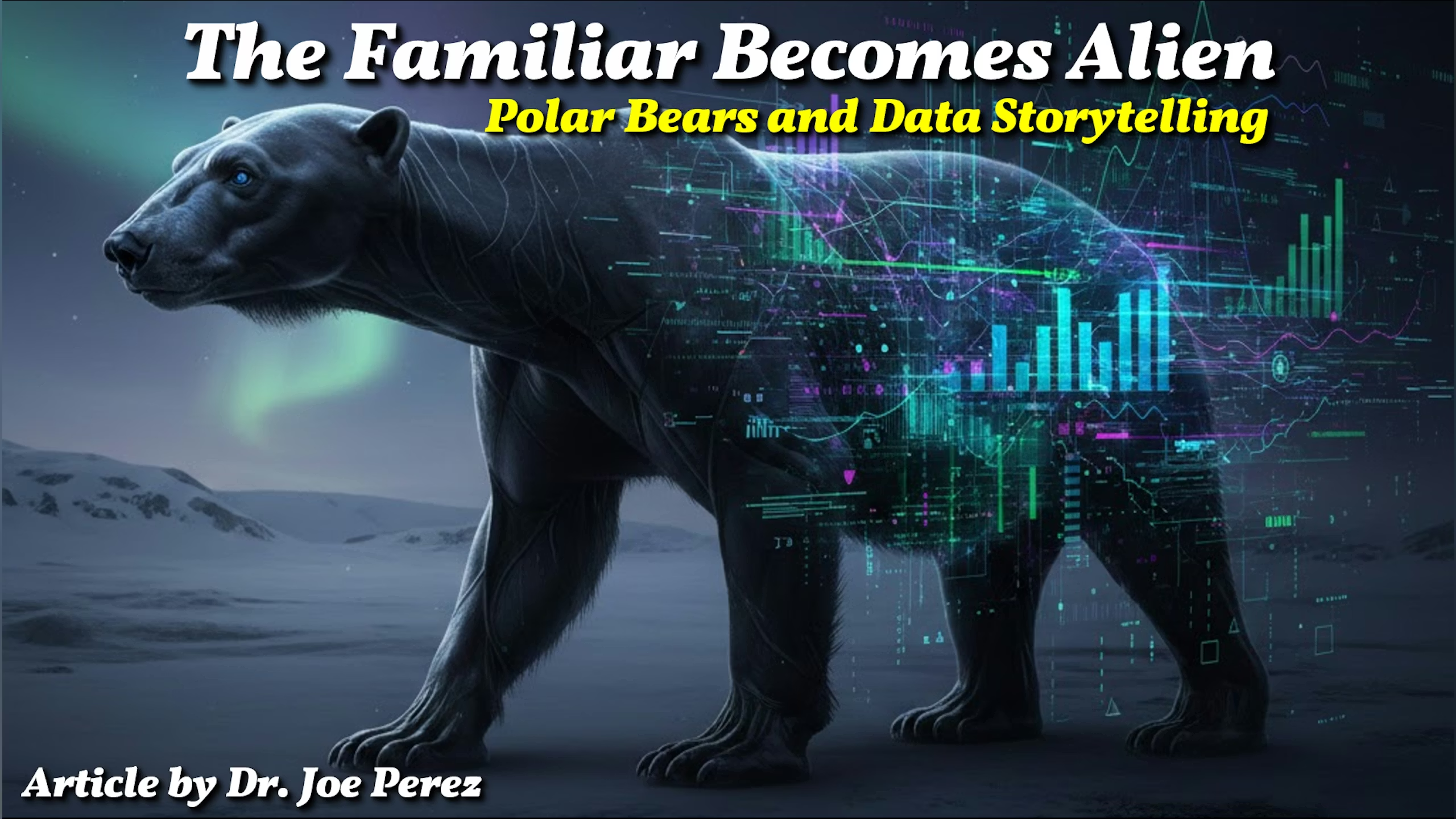
Have you ever seen a picture that made you pause and wonder if your eyes were deceiving you? Let’s say you’re looking at an animal, and something about it just doesn’t seem right. It’s walking on all fours, but its shiny black skin and peculiarly long limbs give it a nearly human appearance. Its neck appears abnormally long, and when it changes positions, its stance is strangely upright. You’re left wondering, “What is this thing?” Then you learn the unexpected: it’s a polar bear, but with no fur.
Seeing a polar bear without its white fur is quite alarming. It seems as though you’re looking at a whole new creature. All those familiar “bear” traits disappear, and your brain scrambles to put it into a category. But the real shock isn’t the animal itself; it’s what’s missing. That thick fur keeps the bear warm, but it also signals to us, “This is a polar bear.” When it’s gone, so is our sense of recognition.
Why This Matters for Data Storytelling
That image of the furless bear sticks with us because it taps into how our minds work. When something is removed from its usual context, we struggle to make sense of it. The same thing happens with data. You can have the right numbers and flawless analysis, but if you present them without narrative or context (that is, if you forget to give your data its “fur”), your audience may feel confused or disconnected.
In my 30-plus years of experience with data storytelling, I’ve seen this problem repeatedly. When you take way the narrative, context, and clarity from data, it goes from familiar to intimidating. But with the right approach, you can turn raw data into something meaningful.
To help you implement this “right approach” I referred to, I developed a simple framework I call B.E.A.R.S. Each letter stands for a principle that helps your data story feel trustworthy, clear, relatable, and compelling. Let’s walk through each piece, drawing from our polar bear example along the way.

Background: Set the Scene for Understanding
Think about where the polar bear lives. Its white fur is the perfect camouflage (a.k.a. “background”) against Arctic snow and ice. If you took that bear out of its environment, its fur would stand out, not blend in. Context shapes everything. In data storytelling, context is your starting point. Without it, your audience is lost.
Every good data story starts with setting the scene, providing background information. This might mean explaining why you collected the data in the first place, what problem you are trying to solve, or perhaps even telling a little bit of history that makes your data relevant to your audience. Providing this background helps you get your audience to see beyond the numbers and get to the story behind the numbers.
So, it’s common for presenters to miss this step, diving headlong into numbers and statistics without providing enough background. What’s left is for your audience to try to figure it out themselves, or even worse, tune you out altogether! What would you do if you were asked to present your quarterly sales figures without mentioning changes in the market or events that happened recently in your industry? Your audience would be left wondering what these numbers really mean! Start with the big picture, providing your audience with a story, analogy, correlation, or timeline before you even present your numbers.
This term, “Background,” represents the snow that makes the polar bear’s camouflage work. When you lay the groundwork, your audience will be ready to see the most important elements.

Emphasis: Highlight What Matters Most
Polar bears have black skin under their fur. This means they can absorb all the sun they can get in the cold Arctic. This is something you wouldn’t normally notice, but it’s very important for their survival. In data storytelling, there’s always an important point that needs to be noticed. Even if it’s not necessarily the most obvious thing in the world.
Emphasis is all about making sure your main point is noticed. Data is everywhere in today’s world. This means that your key point can get lost in all the data and data terms that are floating around. Your goal is to emphasize your key point so that your audience doesn’t miss it.
You can do this in many ways. You can use colors, bold text, and callouts. You can also give cues when you’re talking in front of an audience. You can say things such as “what’s really important here…” or “the main takeaway is….” Even how you present your story can help create emphasis.
But be careful not to overdo it. If you highlight everything, then nothing stands out. Pick the single-most important element, then ensure your audience sees it. Just like the polar bear’s black skin works quietly behind the scenes, your core message should shape the entire story without overwhelming it.

Association: Connect the Unknown to the Known
When you look at a furless polar bear for the first time, your mind is racing with what it is and how it compares to something else. Is it a person? Is it some kind of mutant? Our brains are wired to understand the unknown by relating it to the known. This is the same with data storytelling.
Data on its own does not explain itself. To get the point across clearly, you need to connect it to something that the reader already understands. This is where analogies and metaphors come in handy. Want to explain a complicated algorithm? Compare it to making a recipe or dancing. Want to explain exponential growth? Compare it to how rumors spread or how interest compounds.
This is the same with the visualizations you will be using. Charts and graphs only help if the reader already knows how to read them. Simple visualizations are best; for example, a bar chart may be better than a complicated scatter plot, depending on the audience.
Association is about building bridges. When people can relate your data to something from their own lives, understanding comes naturally. Association transforms strange and confusing information into something that feels familiar and clear.

Relevance: Focus on the Audience’s Need
A polar bear’s fur is perfectly adapted for survival in the Arctic. Every piece of your data story should be just as purposeful. Relevance means leaving out what isn’t needed, so every detail you include drives your message forward.
Often, this means making tough choices. It’s tempting to pack your story with every interesting number or slick chart you have, but too much detail just muddies the waters. Before you add something, ask yourself: Does this help people understand? Does it support my main point? Is it something my audience cares about? How does it connect to their day-to-day living?
Relevance also means tailoring your story for your audience. A board meeting and a public talk might use the same numbers, but they need different details and focus. Take time to learn what your listeners care about, then adjust your story to fit.
Focusing on relevance demonstrates your respect for your audience’s time and attention. You make sure your data story is both informative and genuinely valuable. In a world where attention is scarce, relevance is your best tool; just as the polar bear’s fur is key to its survival.

Sequence: Guide the Journey Step by Step
When you first lay eyes on a furless polar bear, your brain goes through a process: it notices the limbs, the posture, the color, and tries to make sense of each part. The order in which you notice things shapes your whole impression. In data storytelling, the sequence of your narrative is just as important.
A well-structured story leads your audience through the information step by step, making each new idea build on the last. Start with something familiar, then gradually introduce the new or unexpected. This helps people stay engaged and prevents overload. For example, begin with a problem your audience already recognizes, then bring in the data, and finally reveal the insight they can act on.
Transitions are key to making a sequence work. Move smoothly from one idea to the next, so your listeners don’t get lost. Think of your narrative as a guided tour, where each stop prepares your audience for what’s coming.
People remember stories, not spreadsheets. If you present your data as a clear journey, rather than a jumble of facts, your audience will be more likely to follow along and remember what you shared.
Takeaway: Give Your Story the “Fur” It Needs
The image of a furless polar bear grabs our attention because it shows just how much context matters. In the same way, even the best data can seem alien if we forget the elements that make it relatable and engaging.

Start grounding your data storytelling in the B.E.A.R.S. framework (Background, Emphasis, Association, Relevance, and Sequence). Doing so will ensure your insights are not only seen, but also truly understood and remembered. You might say each principle is like a layer of fur; turning raw numbers into stories that stick, persuade, enhance, and inspire action.
At the end of the day, the most powerful data stories balance accuracy with empathy, and precision with creativity. Instead of simply tossing out numbers, you’re guiding people; showing them how something that once seemed strange can start to look familiar, or how there’s something truly remarkable hiding in the details of daily life. When you do this well, your message won’t feel out of place; it will feel like it belongs. Like white fur on a polar bear.