The Cathedral of Data (Understanding Scale and Perspective in Analytics)
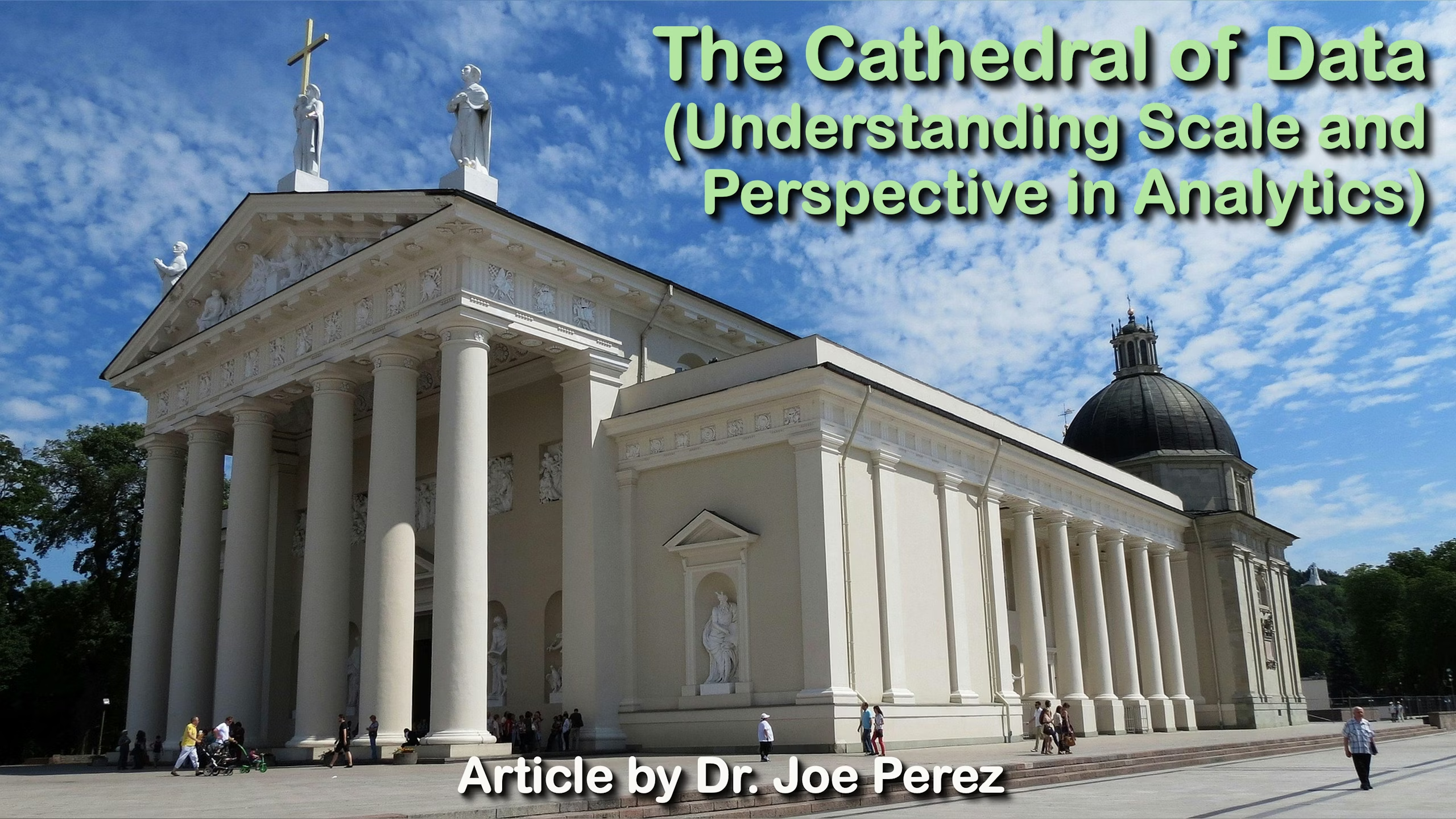
When my wife, Dianna, and I visited Vilnius in November 2024, we made our way to the famous cathedral that anchors the city’s old town. She’s a little over five-foot-three, and watching her tilt her head back to take in the front façade reminded me just how enormous that building really is. Photographs never quite prepare you for the feeling of standing at the foot of something that large. The neoclassical front stretches more than fifty meters across, and the bell tower rises even taller, shooting upward with the confidence of a structure that has dominated its square for centuries.
As we walked around the grounds, the details kept revealing themselves. A statue on the roof, an element that seems modest from a distance, measures four full meters, taller than two adults standing shoulder to shoulder. Inside, the main nave reaches a height most of us only experience in downtown skyscrapers; it could easily fit a six-story building. And the row of Doric columns at the entrance feels almost oversized until you realize this style was meant to impress and steady the eye. Each column is as wide as a sofa, and together they shape the entire tone of the cathedral’s exterior long before anyone steps inside.

The building has been through fires, wars, reconstructions, and shifting architectural tastes since the 13th century, and yet it retains an identity that is unmistakably its own. But what struck me most on that visit wasn’t so much the structure itself; it was how seeing a familiar person standing in front of it instantly clarified its scale. Without that reference point, the brain registers “big,” but with it, you understand the magnitude in a way that feels grounded and personal.
That small moment, my wife dwarfed by a centuries-old structure, captures a principle that comes up repeatedly in analytics. Data without context can be technically accurate but practically unhelpful. Add a relatable frame of reference, and suddenly patterns, risks, and opportunities emerge. Working with data is often less about the numbers themselves and more about how those numbers connect to the world we recognize.
Over the years, I’ve come to rely on a handful of core practices when merging or comparing multiple datasets. These habits have saved countless hours and avoided mistakes that would have undermined entire analytical projects. Much like the builders who had to think ahead about weight distribution and materials, we have to think carefully about the structure that holds our information together.
The first principle is standardization. Before you can bring datasets together, they must speak the same language. A date field using slashes in one place and hyphens in another seems harmless, but it only takes one inconsistent format to break an entire workflow. I often think of it like mixing building materials: stones need to be cut consistently, or the wall won’t stand straight. Modern ETL tools help, but the responsibility to ensure uniformity ultimately falls on the analyst.
Next is ongoing quality control. The Vilnius Cathedral has survived because people cared enough to maintain it, examine its surfaces, and repair damage long before it became dangerous. Data works the same way. Missing values, duplicate entries, and odd outliers may look small, but they can distort averages, inflate totals, or send an analyst chasing explanations that don’t reflect reality. It’s worth asking early whether an unexpected number is a meaningful event or simply an error waiting to be corrected.
Identifiers form another essential pillar. Think of employee IDs, customer numbers, or product codes as the architectural vocabulary of a dataset. If one table uses “00123” and another uses “123” for the same item, you end up with mismatched records and fractured analysis. Consistent identifiers keep everything aligned and prevent the analytical equivalent of trying to bolt together beams that were cut in different units of measurement.
Scale also plays a large role. Just as you wouldn’t compare a massive cathedral to a small neighborhood chapel without acknowledging their different purposes and sizes, you shouldn’t combine datasets without understanding what each represents. A decade-long global report and a single year of regional data can be combined, but not blindly. Their scopes differ, their timeframes differ, and their relevance must be weighed accordingly. Part of our job is to ensure that the comparisons we make are fair and meaningful.

The tools available today (i.e., analytics platforms, scripting languages, powerful integration software) make it easy to work at a scale that was unthinkable not long ago. But tools only amplify the principles we bring to them. Good habits lead to clear, trustworthy insights; sloppy ones simply allow mistakes to spread faster.
And then there is documentation. It may not be glamorous, but it’s the backbone of any reliable process. Builders recorded their methods not only for their own reference, but so later generations could understand how to repair, maintain, or extend what already existed. Proper documentation in analytics serves the same purpose. It preserves the reasoning behind each transformation, the assumptions considered, and the decisions made.
All of this came to mind as we stepped back to take one last look at the cathedral. In the same way that centuries of architects, laborers, and caretakers contributed to the building that stands today, every dataset we work with carries traces of choices made long before we open the file. The value lies not only in the raw materials but in the care we take to assemble them into something coherent.

Bring those core practices into your daily work. Start with cleanly shaped data, anchor everything to identifiers that stay true, protect the integrity of each value, and keep the larger context in view; and the analysis you build becomes something others can rely on without hesitation. When each choice fits the next, the entire structure gains a clarity that doesn’t fade with time. In that moment, your data stops behaving like a loose collection of figures and stands instead like a finished cathedral: intentional, coherent, and strong enough to guide the decisions that follow.