
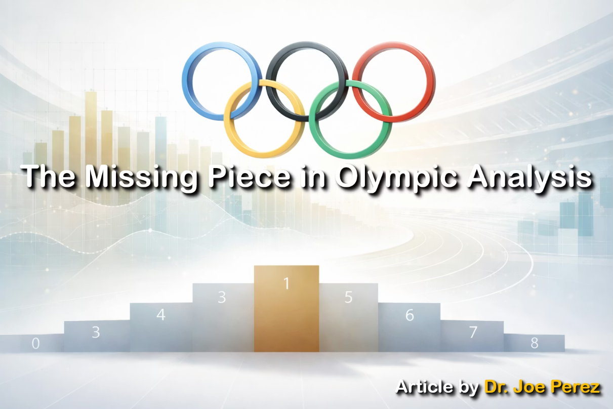
The Missing Piece in Olympic Analysis
A sprinter walks off the Olympic track in fourth place, close enough to the podium to feel the heat of it but not close enough to stand on it. No anthem, no flowers, no medal against their chest. The Games move on. Weeks later, a plain envelope arrives with a certificate so quietly that it could pass for an official letter from any office in the world. Name. Event. Placement. Signatures. It’s called an Olympic diploma, and despite more than a century of tradition, many fans have never heard of it. Some athletes only learn about it when one appears in their mailbox long after the stadium lights have gone cold.
That single sheet of paper opens a surprising window into how we understand recognition, hierarchy, and data. For anyone who thinks about how to tell stories with information, the diploma is a missed chapter (rather than a footnote).
Let’s trace the tradition. When the modern Games began in Athens in 1896, organizers awarded a diploma only to the winner. The idea expanded gradually. Some sources say the top three started receiving diplomas in 1923; others cite a 1924 change in Paris as the first official inclusion of the entire podium. The top six were added in 1949, the top eight in 1981, and that’s where the line remains today. Even the disagreement about the early dates is telling. It’s a reminder that historical data is more like a puzzle with pieces in slightly different boxes than it is a perfect grid.

One may assume that these diplomas are nothing more than oddities stored in Olympic archives, but they’re much more. They carry the signatures of the IOC president and the head of the host organizing committee. They’re designed by the host city but approved by the IOC, just like medals. This pairing (that of global oversight with local authorship) creates an aesthetic that changes every four years. A gymnast in Tokyo and a sailor in Barcelona may never meet, but their top‑eight finishes are recognized with documents shaped by the visual language of the cities that welcomed them. For designers and data storytellers, that’s a pattern worth noticing: information often carries traces of the institutions that define it and the cultures that produce it.
Over time, the diplomas have shifted from ornate to spare. Early editions looked almost theatrical. The 1896 Athens diploma, designed by Nikolaos Gyzis (shown below in the image from Wikipedia), was filled with classical references: the Parthenon overhead, a phoenix rising, Winged Victory offering an olive branch. It read like a myth wrapped around a sporting result. Today’s diplomas are much more restrained: clean fields of white or cream, careful typography, almost monastic in their simplicity. That shift mirrors the way we now present data. The nineteenth century favored decoration; modern design tends to favor clarity and simplicity.
There’s another quiet signal built into the diploma: medalists receive versions in gold, silver, or bronze tones; fourth through eighth place receive an uncolored background. It’s subtle (no ribbons or metallic shine), yet it carries hierarchy without theatrics. A lesson sits right there on the page: you can encode meaning without shouting.

But the diploma’s most interesting effect is analytical rather than aesthetic. Most people experience the Olympics through the medal table; that is, a neat ranking that compresses thousands of performances into a single nightly scoreboard. However, diplomas invite a different view. If you visualize not just medalists but all top‑eight finishers, the map of the Games changes. Countries known for depth rather than peaks begin to stand out. Finalists who finish just shy of renown stop disappearing into the blank space beyond bronze. Suddenly, the Games look less like a contest of superpowers and more like a portrait of global athletic ecosystems.
Think of it as shifting from headlines to full paragraphs. The medal table is a summary statistic: efficient, familiar, incomplete. Diplomas keep the distribution alive. Each event yields up to eight names, which means every Olympics contains thousands of formally recognized achievements that rarely reach the public (unless you visit a site like Olympedia.com and search for specific events). When you start tracking those names, the dataset expands in ways that alter the entire silhouette of the Games. The story you’re able to tell becomes wider, more accurate, and less beholden to spectacle.
Even inside the athlete community, knowledge of diplomas has never been universal. Some competitors treasure them like heirlooms; others discover their existence by accident. That uneven awareness is a small narrative in itself. Designers often mistake “quiet” for “insignificant,” but the diploma is not a novelty. It’s a core part of the official recognition system that simply lives in a lower register of Olympic culture. Surfacing it is more like making a correction than looking at trivia.
One way to do that is with timelines that show how recognition policies have changed. A timeline beginning in 1896 and winding through the 1920s, to include 1949 and 1981, not only marks policy changes, but also shows how recognition gradually widened. A reader can feel the expansion the way they feel the tempo of a story. That’s the value of good temporal design: it gives shape to decisions.
Another useful lens is density. For every event, eight athletes receive a formal acknowledgment. Three get medals; five more get the diploma. Those additional five represent years of training and inches‑close excellence. When we include them in our visuals and narratives, we honor those realities. When we omit them, we flatten the landscape into a podium‑centric view of achievement.
Diplomas also encourage us to rethink the icons we rely on. Medal design always earns attention. And that’s understandable, given how hosts weave local identity into them. Paris included iron fragments tied to the Eiffel Tower; Beijing used jade (see image below from Flickr); Sydney incorporated familiar forms from its harbor and culture. Diplomas are quieter, but they also carry a sense of place and a signature of stewardship. They embody a balance many data systems aim for: rooted in local identity, structured by global rules. Artifacts built in that tension often age well.
There’s practical work hiding behind this too. Medalists are easy to find in official summaries. Diploma recipients are scattered across event pages, national records, and federation logs. Pulling them into a clean dataset takes work: scraping, normalizing names, aligning inconsistent country codes, accounting for event changes across years. But the payoff is enormous. With a complete top‑eight dataset, analysts can study depth, development pipelines, and national resilience in a way that the medal table can never support.

And then there’s the human detail of how diplomas reach athletes. Some are awarded in national ceremonies; others appear in the mail like a casual package. That delivery path becomes part of the recognition story. In data storytelling, route and timing matter because they shape how people experience the thing you’re measuring. Acknowledgment doesn’t always happen under fireworks. Sometimes it happens at a kitchen table.
Team events add another layer. Every athlete on a top‑eight team receives a diploma, even in eras when not all team members received medals. That creates an opportunity to visualize recognition within group results; that is, how individual acknowledgment scales when excellence is collective. It also asks for careful language. Team data is relational data, and visuals that flatten teams into single points miss the nuance.
The rules of return and sanction add a final angle. Under IOC regulations, athletes stripped of results must return their diplomas just as they return medals. Recognition and integrity travel as a pair. For data practitioners, that’s a reminder: achievements exist inside systems that can correct themselves. Omitting governance from the visual story tells only half of what happened.
By the time a reader moves through the whole narrative, the diploma no longer feels like a curiosity. It feels like a missing dimension of a world we thought we understood. The medal podium remains the summit. The diploma adds the ridge lines and slopes that make the summit part of a mountain, not just a point. Designers will draw different charts once they know this. Journalists will cite more names. Fans will cheer a fuller cast of characters.
The most resonant data stories expand the frame without blurring the subject. Diplomas help us do exactly that. They encourage restraint in color and type, transparency in timelines, completeness in counts, respect for institutional context, and generosity toward the broader field of excellence. They remind us that sometimes the smallest artifact carries the biggest structural insight.
When a medal appears in a graphic, the viewer understands immediately. When a diploma appears, the viewer learns something. That’s a trade worth making. Athens in 1896 gave the world a beautifully illustrated certificate for a new era of sport. Today, athletes carry home a minimalist record of their achievement, and the signatures at the bottom affirm that it mattered.
CONCLUSION
The next time the Games begin, track not only who climbs the podium but who earns formal recognition in the top eight. Watch how the map changes. Watch how the story rounds out. A single sheet of paper, understated and official, can shift how we understand excellence—and invite us to tell the whole story with care.